Mobile Friendly Website Design
What is mobile-friendly website design?
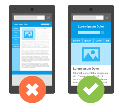
Mobile-Friendly website design, also called responsive design, is a way of designing a website in a way that allows the site to look good on all screen sizes. For example, a website that uses multiple columns on a wide screen can be resized automatically to use one column on a smaller screen.
Why is it important for your business?
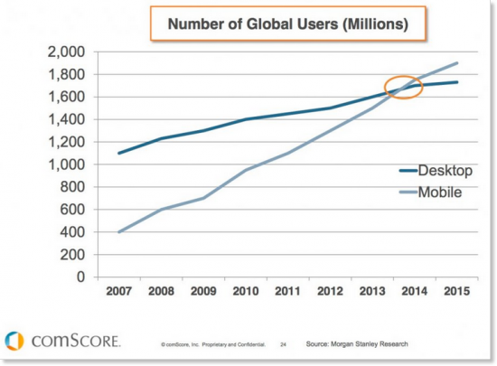
Mobile overtakes desktop mid 2014
In 2014, mobile phones overtook desktop computers as the primary way of accessing the Internet. But mobile phones aren’t the only alternative to a desktop computer. With today’s screen size diversity, it makes sense for a website to automatically resize, depending on the device being used to view it. A website that isn’t designed to be viewed on a phone requires the user to zoom and swipe, just to get around. Eventually this can get a little tedious and can be the reason a user leaves your site in search of a more ‘user friendly’ layout..
People are not only viewing websites from different devices, all with different screen sizes, but the same people are viewing the same websites from different devices. This means, to create the best user experience, websites must work for all the user’s devices, all in the same way. If someone browses your website from their computer, but can’t find the same things when browsing from their phone, it can ruin the experience, and ultimately, lose you a customer.
If your website isn’t easy to use on a mobile device, Google penalises it by ranking it lower on its mobile search results pages than a similar website that is mobile firendly. Google have recently increased the importance of having a mobile-friendly website, helping responsive websites rank higher than those that aren’t designed for mobile. So, having a responsive website will actually help you climb higher on the results page, just for having a mobile-friendly website. Here is a video that explains Google’s algorithm, and what it means for businesses.
Having a responsive website means that, no matter what size devices we use in the future, your site will always look great.
Do you charge extra for this service?
No. Absolutely not. Every new project that we undertake is built with mobile-friendly coding by default. With over 50 percent of web browsing now taking place on smartphones and tablets, this was an obvious step for us to take. It will only, surely, be a matter of time before desktop browsing becomes a thing of the past, although, we will always make sure that our websites work on all devices and screen sizes, certainly for the foreseeable future.
I have an old website, can it be made mobile-friendly?
The short answer is: yes. Although, in many cases, it may be more cost effective to completely re-design an old website, at the same time making it mobile-friendly. There is added pressure these days from Google, to ensure your website is mobile-friendly, and some of you may have already noticed that if you are browsing on a mobile device, Google adds the words ‘Mobile Friendly’ in the search results, as well as ranking more responsive websites higher than those that are restricted to a fixed layout. Ultimately, it is in everybody’s best interest that every website works well on smaller screens, so we can see the idea behind Google’s thinking.
Summary
Mobile web browsing is here to stay, and is gaining popularity at an incredible speed. How much business could you be losing by not ensuring that your website is mobile-friendly? Converting a fixed-width website to mobile-friendly is easier and cheaper than you might think. Contact us today for a free quotation.